Time Series Reconstruction
Contents
Time Series Reconstruction#
Summary#
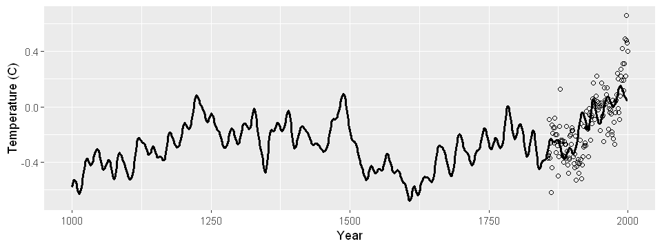
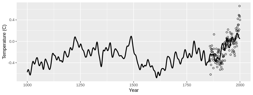
I built a model to predict annual average temperatures all the way back to 1000 AD using proxy data, like tree ring radii. Though recorded temperature data is only available from 1850, proxy data is available much further back in time. My model results in the following reconstruction:
Data Source#
Data was obtained from the faraway package’s globwarm dataset.
It consists of average northern hemisphere temperature nhtemp from 1856 to 2000 and eight climate proxies from 1000 to 2000.
Proxy data include tree ring, ice score, and sea shell data from a variety of geographic regions.
The original data can be found at https://www.ncdc.noaa.gov/paleo-search/study/6271.
Preliminaries#
First, a few frequently used package imports:
Note
You can run and modify the code on this page in a Jupyter environment! Hover over the launch button at the top of the page, then click the Binder button. (Unfortunately Live Code is not currently supported for R.)
tryCatch(
  setwd("./website/stat-ml/"),
  error = function(e) {
    setwd(".")
  }
)
cat("cwd:", getwd())
cwd: /home/adam/projects/website/website/stat-ml
library(faraway) # For data, sumary(), and vif()
library(ggplot2) # Plot multiple ggplots in a grid.
library(gridExtra) # Plot multiple ggplots in a grid.
Next, a few functions that will be frequently used.
I prefer graphical summaries of a data frame over numerical summaries provided by summary().
summary_plot() a dataframe and plots each predictor: barplots for categorical data and histograms for continuous data;
cond_num() computes condition numbers from a model object.
summary_plot <- function(df) {
  for (var in names(df)) {
    data <- df[[var]]
    if (is.factor(data)) {
      plot(data, xlab = var)
    } else {
      hist(data, main = "", xlab = var)
    }
  }
}

cond_num <- function(lmod) {
  X <- model.matrix(lmod)[, -1]
  e <- eigen(t(X) %*% X)
  return(sqrt(e$values[1] / e$values))
}
Finally, the next function looks complex, but it just sets better default figure parameters that work well in a notebook setting.
library(repr)

#' Specify figure parameters
#'
#' Call this function before plots to set the figure dimensions and par()
#' options (if applicable). Defaults are defined for 1- and 2- panel figures;
#' for more complex figures, you should call repr and par() instead.
#' Optionally customize the figure dimensions in a two-element vector
#' `dim`, assumed to be a c(width, height) pair in inches.
set_pars <- function(panels = 1, dim = NULL) {
  if (panels == 1) {
    options(
      repr.plot.width = 3.25,
      repr.plot.height = 2.25
    )
    par(
      mar = c(2.5, 3, 0, .1) + .2,
      mgp = c(1.8, .8, 0),
      ps = 10,
      cex = 1,
      cex.lab = 1.05
    )
  }

  if (panels == 2) {
    options(
      repr.plot.width = 6,
      repr.plot.height = 2.25
    )
    par(
      mfrow = c(1, 2),
      mar = c(2.5, 3, 0, .1) + .2,
      mgp = c(1.8, .8, 0),
      ps = 10,
      cex = 1,
      cex.lab = 1.05
    )
  }

  if (panels == 4) {
    options(
      repr.plot.width = 6,
      repr.plot.height = 4.5
    )
    par(
      mfrow = c(2, 2),
      mar = c(4, 3, 0, .1) + .2,
      mgp = c(1.8, .8, 0),
      ps = 10,
      cex = 1,
      cex.lab = 1.05
    )
  }

  if (!is.null(dim)) {
    options(
      repr.plot.width = dim[1],
      repr.plot.height = dim[2]
    )
  }
}
Data Exploration#
We wish to build a model that can predict nhtemp from the eight climate proxies because proxy data is available for years 1000-2000.
Since the model requires available responses for training, for most of my analysis I’ll use a subset of data where nhtemp is available.
df <- globwarm[!is.na(globwarm$nhtemp), ]
I’ll return to the full dataset for predictions once I’ve chosen the model.
Finally, I won’t include year as a predictor in the regression model as we are interested in past prediction dating back to 1000.
This would be a serious extrapolation in terms of time while the proxies are somewhat periodic, for example:
set_pars(panels = 2)
plot(globwarm$year, globwarm$wusa)
plot(globwarm$year, globwarm$mongolia)
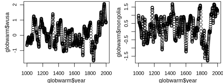
Note that this does not exclude the use of year in informing the model, e.g. model diagnostics. A graphical summary of the response nhtemp and predictors is shown next.
options(repr.plot.width = 6, repr.plot.height = 6)
par(mfrow = c(3, 3), mar = c(2.5, 3, 0, .1) + .2, mgp = c(1.8, .8, 0), ps = 10)
summary_plot(df[, !(names(df) %in% "year")])
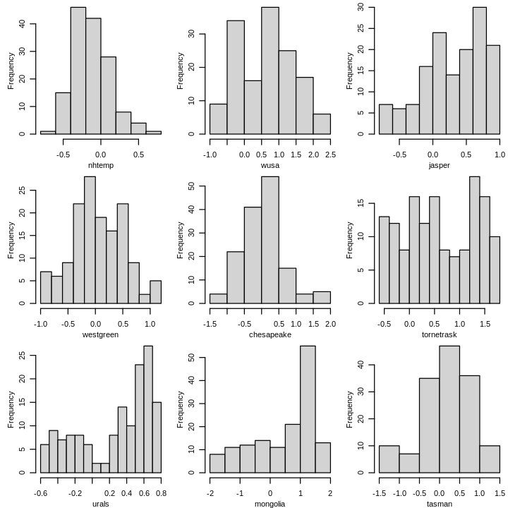
Tree ring proxies jasper, urals, and mongolia are strongly skewed left.
tornetrask, another tree ring proxy, appears nearly uniform.
The other variables, including the response, are approximately symmetric and unimodal.
It is also worth considering relationships between variables.
I do this using Spearman’s rank correlation, which measures the strength of monotonic (but not necessarily linear) relationships.
library(corrplot) # For corrplot()
set_pars(dim = c(5, 5))
correlations <- cor(df[, !(names(df) %in% "year")], method = "spearman")
corrplot(correlations)
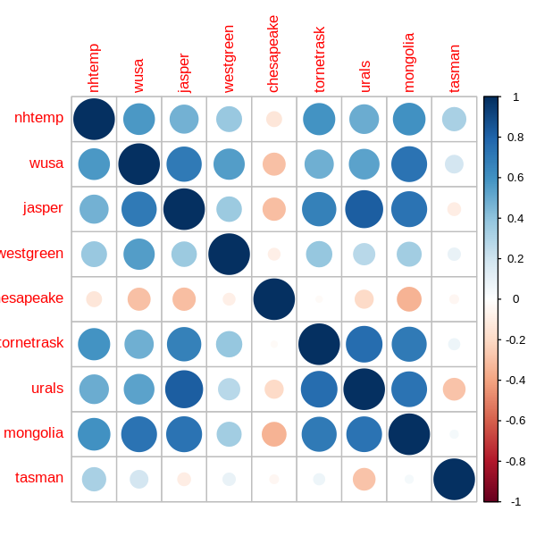
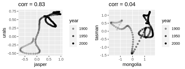
A few variables have multiple strong correlations, e.g. mongolia and urals, so I may need to address collinearity later although it is less problematic for prediction.
There is little noise in the proxy data from year to year, so scatterplots of proxies exhibit interesting relationships over time even when there is little correlation.
set_pars(panels = 2)
plot1 <- ggplot(df) +
  geom_point(aes(jasper, urals, alpha = year)) +
  ggtitle(paste("corr =", round(correlations["jasper", "urals"], 2)))
plot2 <- ggplot(df) +
  geom_point(aes(mongolia, tasman, alpha = year)) +
  ggtitle(paste("corr =", round(correlations["mongolia", "tasman"], 2)))
grid.arrange(plot1, plot2, ncol = 2)
Scatterplots of response against correlated proxies yield more familiar plots; indeed the response is more variable which is why we’re modeling it with a random error.
set_pars(panels = 2)
plot1 <- ggplot(df) +
  geom_point(aes(tornetrask, nhtemp, alpha = year)) +
  ggtitle(paste("corr =", round(correlations["tornetrask", "nhtemp"], 2)))
plot2 <- ggplot(df) +
  geom_point(aes(mongolia, nhtemp, alpha = year)) +
  ggtitle(paste("corr =", round(correlations["mongolia", "nhtemp"], 2)))
grid.arrange(plot1, plot2, ncol = 2)
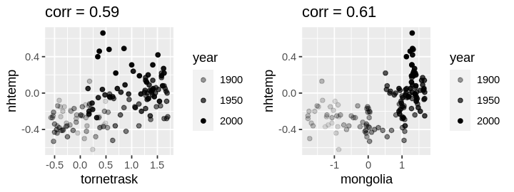
The left (right) plot exhibits a (non)linear trend. Because prediction is of primary interest, I will consider nonlinear transformations later.
Model Diagnostics and Selection#
For now, nothing is particularly alarming, so I’ll start with a simple model linear in all predictors. Since we’re interested in past prediction, I’ll reserve 30% of the oldest data as a test set to select the best model, measured by RMSE, and build the model on the rest of the data.
n <- nrow(df)
test <- df[1:floor(n * .3), ]
train <- df[(floor(n * .3) + 1):n, ]
lmod <- lm(nhtemp ~ . - year, train)
sumary(lmod)
             Estimate Std. Error t value Pr(>|t|)
(Intercept) -0.421128   0.139750 -3.0134 0.003328
wusa         0.149016   0.078883  1.8891 0.061997
jasper      -0.302376   0.108297 -2.7921 0.006356
westgreen   -0.034597   0.076258 -0.4537 0.651114
chesapeake  -0.024290   0.054720 -0.4439 0.658152
tornetrask   0.088663   0.053118  1.6692 0.098450
urals        0.493856   0.219341  2.2515 0.026706
mongolia     0.032372   0.070700  0.4579 0.648112
tasman       0.104790   0.054379  1.9270 0.057031

n = 102, p = 9, Residual SE = 0.18948, R-Squared = 0.42
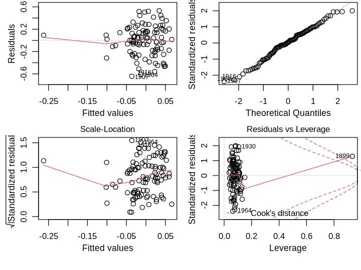
The residual standard error is moderate: \(2 \times RSE\) is more than the interquartile range. I’ll examine R’s default diagnostic plots next.
set_pars(panels = 4)
plot(lmod)
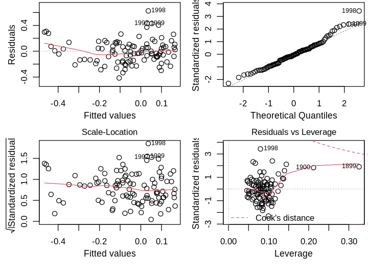
Residuals vs Fitted. There is no obvious trend suggestive of poor model structure. There are a few large residuals, particularly the later years implying the model underestimates the latest data.
Normal Q-Q. The right tail violates the normality assumption, which seem to be the latest data.
Scale-Location. The residuals do not deviate much from the constant variance assumption.
Residuals vs Leverage. The oldest points in the dataset, 1899 and 1900, have the highest leverage and influence, but not high enough for me to consider their removal.
Aside from normality of errors, which is the least important assumption, the simple model looks OK. One could argue the large residuals are problematic for past predictions; perhaps they are indicative of global warming in recent years, a small range of time with distinct behavior that my simple linear model cannot capture. I’ll test this formally using leave-one-out Studentized residuals, which are approximately distributed as \(\mathcal{T}(n−p−1)\), where \(p\) is the number of parameters. Using a Bonferroni correction at the \(\alpha=0.05\) level,
tresid <- rstudent(lmod)
which(abs(tresid) > abs(qt(.05 / n, lmod$df.residual - 1)))
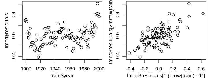
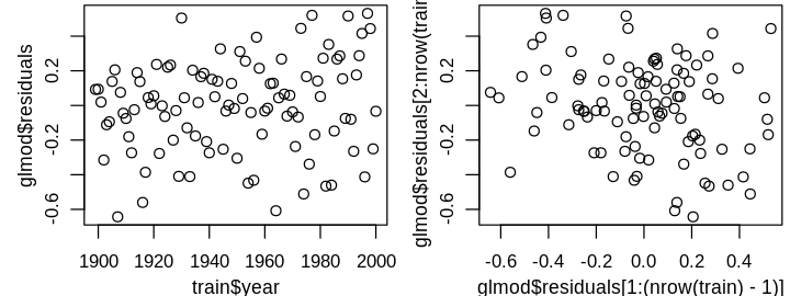
only the largest residual is a statistical outlier. Before I consider removing it, I’ll investigate a larger issue that is difficult to observe from the above four diagnostics: the independent errors assumption. This assumption can be difficult to check in general, and often requires some domain knowledge. Time series data is often correlated because variables don’t change instantaneously. For instance, today’s temperature is correlated with tomorrow’s; dramatic swings in daily temperature are rare. Unless the model perfectly predicts these seasonal correlations, I’d expect residuals to be correlated from year to year. This is hard to see from the diagnostic plots because year has not yet informed our model, but can be seen in plots of residuals against year and \(\widehat{\varepsilon}_{i+1}\) against \(\widehat{\varepsilon}_i\).
set_pars(panels = 2)
plot(train$year, lmod$residuals)
plot(lmod$residuals[1:(nrow(train) - 1)], lmod$residuals[2:nrow(train)])
To address the correlated errors, I’ll use generalized least squares (GLS) with an AR1 correlation structure. Specifically, I’ll model the the errors as a linear 1-step lag:
where \(\delta_i \sim \mathcal{N}(0, \tau^2)\). The resultant covariance matrix of the errors has the form
We can then transform the response and design matrix to \(\boldsymbol{y}'=\boldsymbol{S}^{-1} \boldsymbol{y}\) and and \(\boldsymbol{X}'=\boldsymbol{S}^{-1}\boldsymbol{X}\), where \(\boldsymbol{S}\) is obtained from the Choleski decomposition \(\boldsymbol{\Sigma}=\boldsymbol{S}\boldsymbol{S}^{T}\), and regress \(\boldsymbol{y}'\) on \(\boldsymbol{X}'\):
If \(\boldsymbol{\Sigma}\) is correctly specified, the transformed errors \(\boldsymbol{\varepsilon}'=\boldsymbol{S}^{-1} \boldsymbol{\varepsilon}\) are i.i.d.\(^{\dagger}\) I’ll implement GLS using the nlme package.
library(nlme)
glmod <- gls(nhtemp ~ . - year, correlation = corAR1(form = ~year), train)
summary(glmod$modelStruct)
Correlation Structure: AR(1)
 Formula: ~year
 Parameter estimate(s):
     Phi
0.856977
We observe strong correlation between residuals. Let’s see how the coefficients change:
summary(glmod)$tTable
| Value | Std.Error | t-value | p-value | |
|---|---|---|---|---|
| (Intercept) | -0.18738021 | 0.3107210 | -0.60304977 | 0.5479434 |
| wusa | 0.00769262 | 0.1829881 | 0.04203891 | 0.9665578 |
| jasper | -0.17928669 | 0.3205254 | -0.55935245 | 0.5772658 |
| westgreen | 0.06251127 | 0.1632877 | 0.38282892 | 0.7027202 |
| chesapeake | 0.05893335 | 0.1242621 | 0.47426633 | 0.6364217 |
| tornetrask | 0.01636588 | 0.1311168 | 0.12481914 | 0.9009361 |
| urals | 0.36419117 | 0.5579029 | 0.65278590 | 0.5155048 |
| mongolia | 0.02987473 | 0.2015126 | 0.14825242 | 0.8824645 |
| tasman | 0.10277331 | 0.1545286 | 0.66507626 | 0.5076477 |
Point estimates change and there is substantially more uncertainty.
Remember, though, from a statistical standpoint this model should be better, e.g. its residuals should no longer be correlated.
gls objects do not have the four graphical diagnostics we are accustomed to.
I’ll implement GLS using lm() instead, with the help of other functions from nlme to specify the covariance structure \(\boldsymbol{\Sigma}\) and transform the data accordingly, using the estimated \(\phi\) above.
Sigma <- corMatrix(glmod$modelStruct$corStruct)
S <- t(chol(Sigma))
y <- solve(S) %*% train$nhtemp # y'
X <- solve(S) %*% model.matrix(nhtemp ~ . - year, train) # X'
rownames(y) <- rownames(X) <- rownames(train)
glmod <- lm(y ~ X + 0)
sumary(glmod)
               Estimate Std. Error t value Pr(>|t|)
X(Intercept) -0.1873802  0.3107210 -0.6030   0.5479
Xwusa         0.0076926  0.1829881  0.0420   0.9666
Xjasper      -0.1792867  0.3205254 -0.5594   0.5773
Xwestgreen    0.0625113  0.1632877  0.3828   0.7027
Xchesapeake   0.0589333  0.1242621  0.4743   0.6364
Xtornetrask   0.0163659  0.1311168  0.1248   0.9009
Xurals        0.3641912  0.5579029  0.6528   0.5155
Xmongolia     0.0298747  0.2015126  0.1483   0.8825
Xtasman       0.1027733  0.1545286  0.6651   0.5076

n = 102, p = 9, Residual SE = 0.27744, R-Squared = 0.03
We’ve recovered the same GLS model using lm(). On to diagnostics, which appear substantially different:
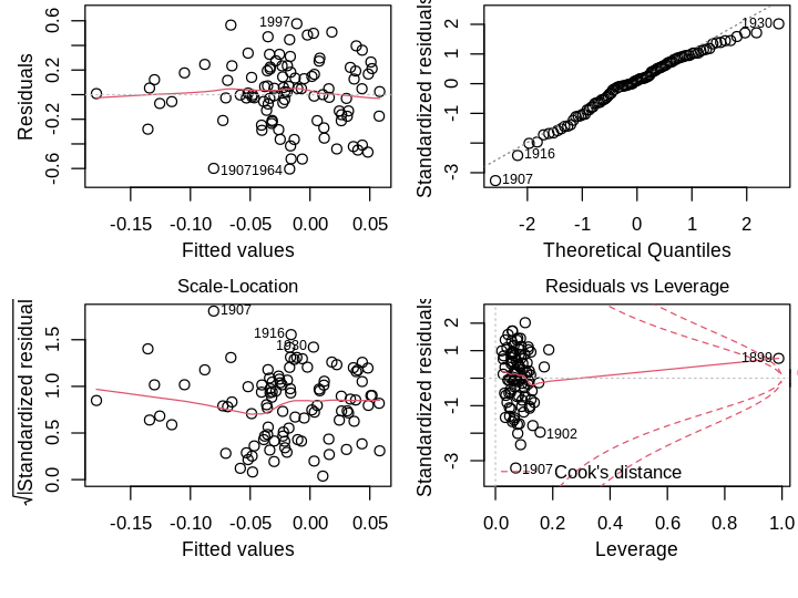
set_pars(panels = 4)
plot(glmod)
1988 is no longer an outlier—in fact, no Studentized residual is statistically significant after Bonferroni correction at \(\alpha=0.05\). 1899 is now a high leverage point point with large influence. However, this is an artifact of the transformed design matrix \(\boldsymbol{X}\)’, whose first row is identical to \(\boldsymbol{X}\). For this reason, I won’t remove this point.\(^{\dagger}\) The qqplot is improved, though still has a problematic right tail. The GLS model introduces heteroscedasticity, which I’ll address later. Importantly, residual plots no longer show correlation.
set_pars(panels = 2)
plot(train$year, glmod$residuals)
plot(glmod$residuals[1:(nrow(train) - 1)], glmod$residuals[2:nrow(train)])
To check the degree of collinearity, I examined the condition numbers. The largest was 11.75677, so I won’t take any special precautions. We can’t address heteroscedasticity using a Box–Cox transformation of the response because some \(y<0\). Residuals plots against each predictor don’t suggest any predictor transformations. Instead, I’ll add another candidate model using weights. Since year and nhtemp are correlated and higher predicted nhtemp values have more variance, I’ll use some form of temporal weighting.
set_pars(panels = 4)
wts <- 1 / (as.integer(rownames(X)) - min(as.integer(rownames(X))) + 1)**.5
wglmod <- lm(y ~ X + 0, weights = wts)
plot(wglmod)
Warning message in sqrt(crit * p * (1 - hh)/hh):
“NaNs produced”
Warning message in sqrt(crit * p * (1 - hh)/hh):
“NaNs produced”
The exact form of the weights was found by trial and error. The resultant weights span a large range; the oldest point is weighed more than 10 times the most recent point, which results in a larger Cook’s distance. I’ll see whether the weights help in prediction next, skipping variable selection since \(n/p\) is not too small and we’re focused on prediction.
Optimizing Predictive Accuracy#
I’ll grade models on the mean RMSE of their predictions for the test data.
get_rmse <- function(ypred, yobs) {
  sqrt(mean((ypred - yobs)**2))
}
Since the GLS models were trained on transformed data, I’ll compute predictions using extracted model coefficients rather than the predict() method.
X_test <- model.matrix(nhtemp ~ . - year, test)
get_rmse(X_test %*% coef(lmod), test$nhtemp)
get_rmse(X_test %*% coef(glmod), test$nhtemp)
get_rmse(X_test %*% coef(wglmod), test$nhtemp)
The AR1 model without the additional weighting performs best. There is the possibility of improvement if we use shrinkage methods. I’ll employ ridge regression using the glmnet package, which allows us to flexibly shrink predictor coefficients; in particular, we can specify no penalty on the (transformed) intercept term in the GLS models.
library(glmnet)
set.seed(1) # For reproducibility (from cross-validation).
ridge_lmod <- cv.glmnet(
  x = as.matrix(train[, !(names(train) %in% c("nhtemp", "year"))]),
  y = train$nhtemp, alpha = 0, intercept = TRUE
)
get_rmse(X_test %*% coef(ridge_lmod), test$nhtemp)
ridge_glmod <- cv.glmnet(
  X, y,
  alpha = 0, intercept = FALSE, penalty.factor = c(0, rep(1, ncol(X) - 1))
)
get_rmse(X_test %*% coef(ridge_glmod)[2:(ncol(X) + 1)], test$nhtemp)
ridge_wglmod <- cv.glmnet(
  X, y,
  alpha = 0, intercept = FALSE, penalty.factor = c(0, rep(1, ncol(X) - 1)),
  weights = wts
)
get_rmse(X_test %*% coef(ridge_wglmod)[2:(ncol(X) + 1)], test$nhtemp)
Surprisingly, the linear model with ridge regression obtains the best accuracy among all models considered. Ridge regression doesn’t benefit the GLS models—inspection of the penalized coefficients show all terms but the intercept are shrunk to zero. I’ll continue with glmod and ridge_lmod to compare their predictions. If there are stark differences I’ll need to think harder on picking one model.
Making Predictions#
I’ll train the models on all data with available nhtemp.
ridge_lmod <- cv.glmnet(
  x = as.matrix(df[, !(names(df) %in% c("nhtemp", "year"))]),
  y = df$nhtemp, alpha = 0, intercept = TRUE
)

glmod <- gls(nhtemp ~ . - year, correlation = corAR1(form = ~year), df)
Prediction on all data are computed next.
ridge_lmod_pred <- predict(
  ridge_lmod,
  newx = as.matrix(globwarm[, !(names(globwarm) %in% c("nhtemp", "year"))])
)
glmod_pred <- predict(glmod, globwarm[, !(names(globwarm) %in% c("nhtemp"))])
I think it’s instructive to first plot the fits on the subset of fully available data.
set_pars(panels = 1)
plot(df$year, df$nhtemp)
lines(globwarm$year, ridge_lmod_pred, col = 2)
lines(globwarm$year, glmod_pred, col = 3, lty = 1)
legend("topleft", legend = c("ridge", "GLS"), lty = 1, col = 2:3)
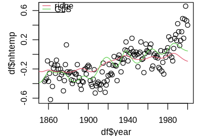
The GLS model better captures temporal variation, while the ridge model hovers around the mean temperature -0.12034. This feature is even more pronounced when we predict back to year 1000, leading to drastically different predictions.
set_pars(dim = c(8, 3))
plot(globwarm$year, globwarm$nhtemp)
lines(globwarm$year, ridge_lmod_pred, col = 2)
lines(globwarm$year, glmod_pred, col = 3)
legend("topleft", legend = c("ridge", "GLS"), lty = 1, col = 2:3)
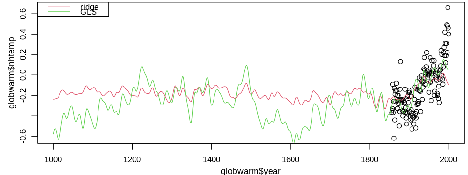
Since the ridge model makes no correction for the strongly correlated residuals, other than shrinking estimates, I favor the GLS model.
Converting it to ggplot() for a prettier plot yields the temperature reconstruction:
set_pars(dim = c(8, 3))
df <- data.frame(year = globwarm$year, temp = globwarm$nhtemp, pred = glmod_pred)
ggplot(df) +
  geom_line(aes(x = year, y = pred), size = 1) +
  geom_point(aes(x = year, y = temp), shape = 1) +
  xlab("Year") +
  ylab("Temperature (C)")
Warning message:
“Removed 856 rows containing missing values (geom_point).”
Conclusion#
I built a standard least squares regression model, a model accounting for correlated errors, and a model with additional weights after correlation adjustment. Each of these models was tuned to have highest predictive accuracy on test data, as well as their regularized counterparts. Though one of the regularized models had the best predictive accuracy, its underlying structure is not suited for time series data, which was validated by graphical diagnostics. A more detailed analysis should optimize cross-validated predictive accuracy, accounting for correlation structure, and contain uncertainty estimates in the reconstruction.